Bootstrap Theme "Shortcodes"
These aren’t really “shortcakes” in the traditional WordPress sense, but are CSS components built into our Bootrap-based themes that you…
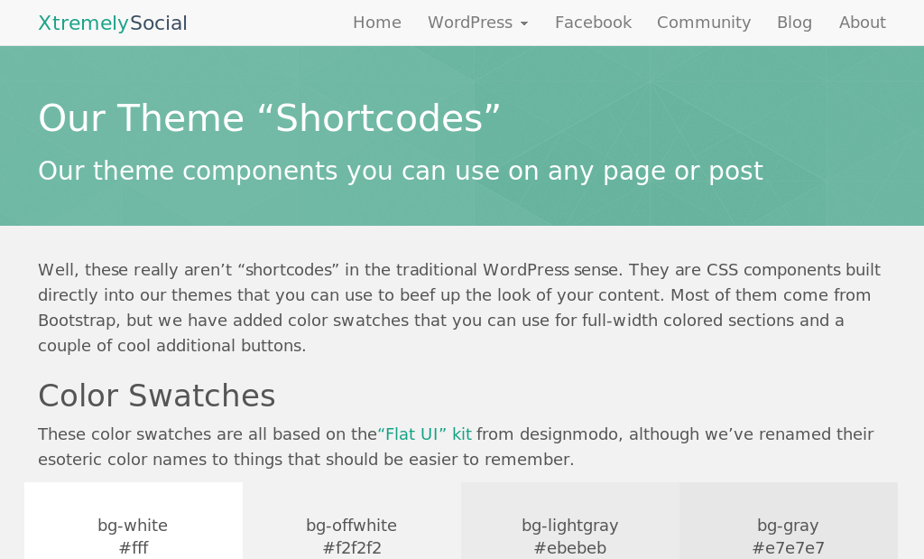
Well, these really aren’t “shortcodes” in the traditional WordPress sense. They are CSS components built directly into our themes that you can use to beef up the look of your content. Most of them come from Bootstrap, but we have added color swatches that you can use for full-width colored sections and a couple of cool additional buttons.
Color Swatches
These color swatches are all based on the “Flat UI” kit from designmodo, although we’ve renamed their esoteric color names to things that should be easier to remember.
#fff
#f2f2f2
#ebebeb
#e7e7e7
#e0e0e0
#1abc9c
#16a085
#2ecc71
#27AE60
#3498db
#2980b9
#9B59B6
#8E44AD
#34495e
#2C3E50
#f1c40f
#F39C12
#E67E22
#D35400
#ff7878
#E74C3C
#C0392B
#2f2f2f
#222
#000
<div class="section bg-darkgreen centered">bg-darkgreen</div>
Note that you can also use these colors for text as well. Just use the prefix ‘color-‘ instead of ‘bg-‘. For example, this text is in color-blue.
<span class="color-blue">this text is in color-blue</span>
Text Alignment
Of course WordPress has left, center, and right alignment that you can choose from the Visual Editor and that’s the easiest way to do it. However, because this theme is based on Bootstrap, there are some additional ones.
Left aligned text
Center aligned text
Right aligned text
Justified text. Lorem ipsum dolor sit amet, consectetur adipisicing elit, sed do eiusmod tempor incididunt ut labore et dolore magna aliqua. Ut enim ad minim veniam, quis nostrud exercitation ullamco laboris nisi ut aliquip ex ea commodo consequat. Duis aute irure dolor in reprehenderit in voluptate velit esse cillum dolore eu fugiat nulla pariatur. Excepteur sint occaecat cupidatat non proident, sunt in culpa qui officia deserunt mollit anim id est laborum.
<p class="alignleft">Left aligned text</p> or <p class="text-left">Left aligned text</p>
<p class="aligncenter">Center aligned text</p> or <p class="text-center">Center aligned text</p>
<p class="alignright">Right aligned text</p> or <p class="text-right">Right aligned text</p>
<p class="text-justify">Justified text</p>
Text Transformation
Transform text in components with text capitalization classes. These are especially useful in our themes, either to add capitalization or remove it from themes like Spot that automatically capitalize certain headings.
LOWERCASED TEXT
uppercased text
capitalized text
<p class="text-lowercase">LOWERCASED TEXT</p>
<p class="text-uppercase">uppercased text</p>
<p class="text-capitalize">capitalized text</p>
Buttons, Buttons, and More Buttons
<a href="#" class="btn btn-primary">btn-primary</a>
Progress Bars
Standard (progress-bars)
Striped (progress-striped)
Animated (progress-bar-striped active)
Stacked (all in same “progress” div)
<div class="progress-bar progress-bar-success" style="width: 40%;" role="progressbar"><span class="sr-only">40% Complete (success)</span></div>
Tabbed Content
This is some text related to profile. Rutrum magna nonummy ullamcorper dis facilisis elementum. Per Sodales luctus commodo orci lacinia pharetra consequat elit vestibulum nam blandit primis. Malesuada quis primis phasellus eget praesent est montes imperdiet mattis habitasse hymenaeos. Amet mus condimentum aliquet consectetuer.
Tempor eget pulvinar aliquet penatibus ante tristique justo odio. Odio magna torquent, nostra donec interdum eget lobortis nonummy conubia potenti dictumst sagittis nulla.
<ul class="nav nav-tabs">
<li class="active"><a href="#home" data-toggle="tab">Home</a></li>
<li><a href="#profile" data-toggle="tab">Profile</a></li>
...
</ul>
<div class="tab-content">
<div class="tab-pane active" id="home">This is some text related to <b>home</b>.</div>
<div class="tab-pane" id="profile">This is some text related to <b>profile</b>.</div>
...
</div>
Collapsible Content Panels
<div id="accordion" class="panel-group">
<div class="panel panel-default">
<div class="panel-heading">
<h4 class="panel-title"><a href="#collapseOne" data-toggle="collapse" data-parent="#accordion">Collapsible Group Item #1 +
</a></h4>
</div>
<div id="collapseOne" class="panel-collapse collapse in">
<div class="panel-body">...</div>
</div>
</div>
<div class="panel panel-default">
<div class="panel-heading">
<h4 class="panel-title"><a href="#collapseTwo" data-toggle="collapse" data-parent="#accordion">Collapsible Group Item #2 +
</a></h4>
</div>
<div id="collapseTwo" class="panel-collapse collapse">
<div class="panel-body">...</div>
</div>
</div>
<div class="panel panel-default">
<div class="panel-heading">
<h4 class="panel-title"><a href="#collapseThree" data-toggle="collapse" data-parent="#accordion">Collapsible Group Item #3 +
</a></h4>
</div>
<div id="collapseThree" class="panel-collapse collapse">
<div class="panel-body">...</div>
</div>
</div>
</div>
Alerts
<div class="alert alert-primary">This is the text for the alert (alert-primary)</div>Panels
Default Panel (panel-default)
Primary Panel (panel-primary)
Success Panel (panel-success)
Info Panel (panel-info)
Warning Panel (panel-warning)
Danger Panel (panel-danger)
<div class="panel panel-primary">
<div class="panel-heading"><h3 class="panel-title">Primary Panel (panel-primary)</h3></div>
<div class="panel-body">Panel content</div>
</div>
9 responses to “Bootstrap Theme "Shortcodes"”
Comments
-
Como utilizo nesse tema essa função “Full-width Image
Just add h1 and h2 tags in the caption” mencionada acima?
Parabéns pelo seu tema!-
As I use in this theme this function “Full-width Image
Just add h1 and h2 tags in the caption “mentioned above?
Congratulations on your theme!
-
-
What does “quicktags” mean? [fullwidth][/fullwidth], or ?
“This theme includes two “quick tags” in the WordPress HTML editor to add a normal full-width sections or a special “header” section that has a thick bottom border. You just need to make sure you are in Text mode instead of Visual mode in the editor. The quicktags are as follows:
fullwidth – For use in a full-width page template or fullwidth article. Inserts a section and container for your content. Default color is offwhite, but you can change it to any of our included colored backgrounds.”
-

If you set a page to any of the included fullwidth page templates, then you need to handle putting your text into a Bootstrap “container”. This is so you can add a colored section that fills the entire width of the page, but then contain the content of that section so there is proper margins on the left and right.
For example, let’s say we want a full-width blue section on our page. We can do it like this:
<div class="section bg-blue">
<div class="container">>
Our text and other content goes here and has proper margins on it.
</div>
</div>
These “quicktags”, just insert HTML similar to above for you so you don’t have to type it all.
-
-
I noticed you recommend Agnosia Bootstrap Carousel by AuSoft, does that mean JavaScript Carousel component is not included with the theme by default?
If its not included how complicated would it be for a novice to add it and/or other components not included in the theme?
-
I forgot to check the boxes so I get notified o.O
-
You can do anything with the theme that Bootstrap can do, even without plugins. You have to paste in the HTML samples and edit it. Carousels are covered here: http://getbootstrap.com/javascript/
-
-
Hi, Elana. I think its a good idea for me to post the code blocks right after each example. In the meantime, every “shortcode” except the color palette is standard Bootstrap HTML. You can see how to code any of the “shortcodes” here: http://getbootstrap.com/components/
-
interesting theme, but to use it it would have been great to have more “educational” instruction.
e.g. code examples for each “shortcode”
Leave a Reply
You must be logged in to post a comment.